
Interior Design for Dementia Care Homes
Wednesday, February 14, 2018
How to use color and design elements to improve quality of life
We all know that as our bodies age, the way we see things changes—quite literally. Cataracts and other issues cloud and distort vision so that colors and designs are not as sharp and vivid to an older eye. But, did you know that dementia and Alzheimer’s disease changes our vision even further? The brain of those living with memory loss interprets what the eye sees differently than those who have better memory function. As a result, choices in design elements may impact a person’s feeling of safety and security so that interior design for dementia care homes needs to be carefully planned to ensure residents feel comfortable in their surroundings.
How the brains of memory care residents differ
Besides struggling with memory recall, those living with dementia and Alzheimer’s disease lose depth perception. According to online mental health resource PsychCentral, “A light fixture flush with a nine-foot-high ceiling may seem to them to be reachable while standing on the floor … A strip of black linoleum visible around the edges of a light carpet can be interpreted to be a bottomless pit ….”
Added to that, these seniors have an especially difficult time interpreting shapes and other visual cues in poor lighting, both lighting that is dim and casts shadows or light that glares, as from a bright window.
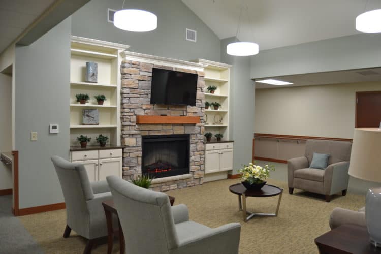
3 elements to consider in interior design for dementia care homes
If you are looking to design a new facility or remodel your current space, there are three design elements to consider when creating welcoming spaces for those with memory loss. Some of these ideas are so simple, you could easily make some changes even if you are not undertaking a larger building project.
Lighting
Not only does sufficient lighting increase safety and aid in wayfinding, studies have found that seniors who spend much of their time in well-lit spaces sleep better and exhibit fewer episodes of anger or other disruptive emotions. The Lighting Research Center estimates that seniors need about 70 percent more light than they did in their earlier years to see objects. LED lighting design helps in meeting these needs. LED lights also can be mounted under beds for better wayfinding for residents and third-shift caretakers, as well as under mirrors and along handrails.
To reduce glare from a window bouncing off objects, use carpet and sheer window treatments. Also, consider the glare that could be caused from light reflecting on artwork that is behind glass.
Patterns
It’s best to keep interior design simple—like carpeting, furniture and even bedspreads—for Alzheimer’s patients and others living with memory loss. Complex patterns and prints will confuse these residents, maybe even leading them to believe objects are moving. In addition, residents may interpret patterns on floors, like checkered rugs, as holes they may step in or steps up or down. Even a dark throw rug placed on a light-colored floor could be mistaken for an unsafe hole.
This simplicity extends to the amount of décor, as well. Less is more for those with memory loss, as clutter can confuse them to the point where they will shut down and be less active.
Color contrast
Like the example of a dark rug on a light floor, color contrast extends to other interior design elements. Chair colors should contrast with floors so the senior clearly sees where to sit. Even tablecloths and table settings have an impact on seniors. Contrasting the plate color with either a placemat or tablecloth will allow your residents to see their food and eat more. Research also has shown that bright plates stimulate appetites.
The best colors for dementia patients
While specific colors may or may not be better for people living with memory loss, we do know that aging eyes distort colors. And, certain colors can make spaces appear or feel smaller or larger, warmer or cooler.
When choosing colors for your facility, here are a few things to keep in mind:
- Colors can help define an area, improving wayfinding and reminding residents of where they are based on the color.
- Color contrasts between floors and walls can improve balance in people who have poor vision.
- High color contrasts in small spaces can cause eyestrain and perhaps headaches.
In addition, it’s important to remember that seniors cannot easily distinguish between blues and greens, so avoid attempting to differentiate two things—like a sign and wall—with these like colors. Also, many people are colorblind and are unable to see the difference between red and green.
Contact our interior design experts
Considerations for how interior design affects those living with memory loss has become such a hot topic, there is even an app developed by Alzheimer’s Australia for those who can use help, especially in private homes. With so much to consider in interior design for dementia care homes, the task can be daunting. But, we are here to help.
If you are interested in learning more about architectural design and facility planning to enhance memory care, read our Memory Care Facility Design blog. As specialists in senior living community design and construction, Community Living Solutions can help you design, remodel or build a memory care facility to enhance your marketability. For your free consultation, contact Terry McLaughlin at 920-969-9344.
If you are interested in learning how outdoor spaces can improve the health of those living with memory loss, read our Dementia Garden Design blog.
Search Blog
Categories
Archives
- June 2025
- August 2023
- April 2023
- February 2022
- March 2021
- February 2021
- April 2020
- January 2020
- December 2019
- November 2019
- July 2019
- April 2019
- March 2019
- February 2019
- January 2019
- November 2018
- September 2018
- August 2018
- July 2018
- June 2018
- May 2018
- April 2018
- March 2018
- February 2018
- January 2018
- December 2017
- November 2017
- October 2017
- September 2017
- August 2017
- July 2017
- June 2017
- May 2017
- April 2017
- March 2017
- February 2017
- January 2017